Gene Body Analysis
Charles Mordaunt and Julia Mouat
2026-08-23
Source:vignettes/Gene_Body_Analysis.Rmd
Gene_Body_Analysis.RmdIntroduction
In this vignette, we use Comethyl to construct a weighted region comethylation network from WGBS data using CpGs grouped by gene body annotation. Because gene body methylation has been previously shown to correlate with expression, this approach allows for more direct gene mapping and functional interpretation. We identify modules of comethylated regions, investigate correlations with sample traits, and analyze functional enrichments.
The data set includes 74 male cord blood samples from newborns who were later diagnosed with autism spectrum disorder (ASD) and those with typical development (TD). Comethylation modules were associated with 49 sample characteristics including diagnosis, cell types, sample sequencing information such as percent CpG methylation, and demographic data such as home ownership. The goal of this analysis is to explore interactions between the methylome and sample traits prior to diagnosis with ASD.
Raw data is available on GEO (GSE140730), see the previous publication for more details.
Environment Setup
All analyses should be run within the comethyl pixi environment to ensure reproducibility. If you have not yet set up the environment, see the Get Started vignette for full installation instructions.
Activate the environment before launching R:
Set Global Options
WGCNA::enableWGCNAthreads() allows parallel calculations
with the specified number of threads for all functions using
WGCNA::cor() and WGCNA::bicor(). If the number
of threads is not provided, the default is the number of processors
online.
options(stringsAsFactors = FALSE)
Sys.setenv(R_THREADS = 1)
WGCNA::enableWGCNAThreads(nThreads = 4)
Read Bismark CpG Reports
We read in an excel table with openxlsx::read.xlsx()
where the first column includes the names of sample Bismark CpG reports
and all other columns include trait values for each sample. All trait
values must be numeric, though traits can be categorical or continuous.
getCpGs() reads individual sample Bismark CpG reports into
a single BSseq object and then saves it as a .rds file. See Inputs
for more information.
Examine CpG Totals at Different Cutoffs
getCpGtotals() calculates the total number and percent
of CpGs remaining in a BSseq object after filtering at different
cov (coverage) and perSample cutoffs and then
saves it as a tab-separated text file. The purpose of this function is
to help determine cutoffs to maximize the number of CpGs with sufficient
data after filtering. Typically, the number of CpGs covered in 100% of
samples decreases as the sample size increases, especially with
low-coverage datasets. The goal for filtering is to try and balance the
sequencing depth per CpG and the number of samples with the total number
of CpGs.
plotCpGtotals() plots the number of CpGs remaining after
filtering by different combinations of cov and
perSample in a line plot and then saves it as a PDF.
plotCpGtotals() is designed to be used in combination with
getCpGtotals(). A ggplot is produced and can be further
edited outside of this function if desired.
CpGtotals <- getCpGtotals(bs, file = "CpG_Totals.txt")
plotCpGtotals(CpGtotals, file = "CpG_Totals.pdf")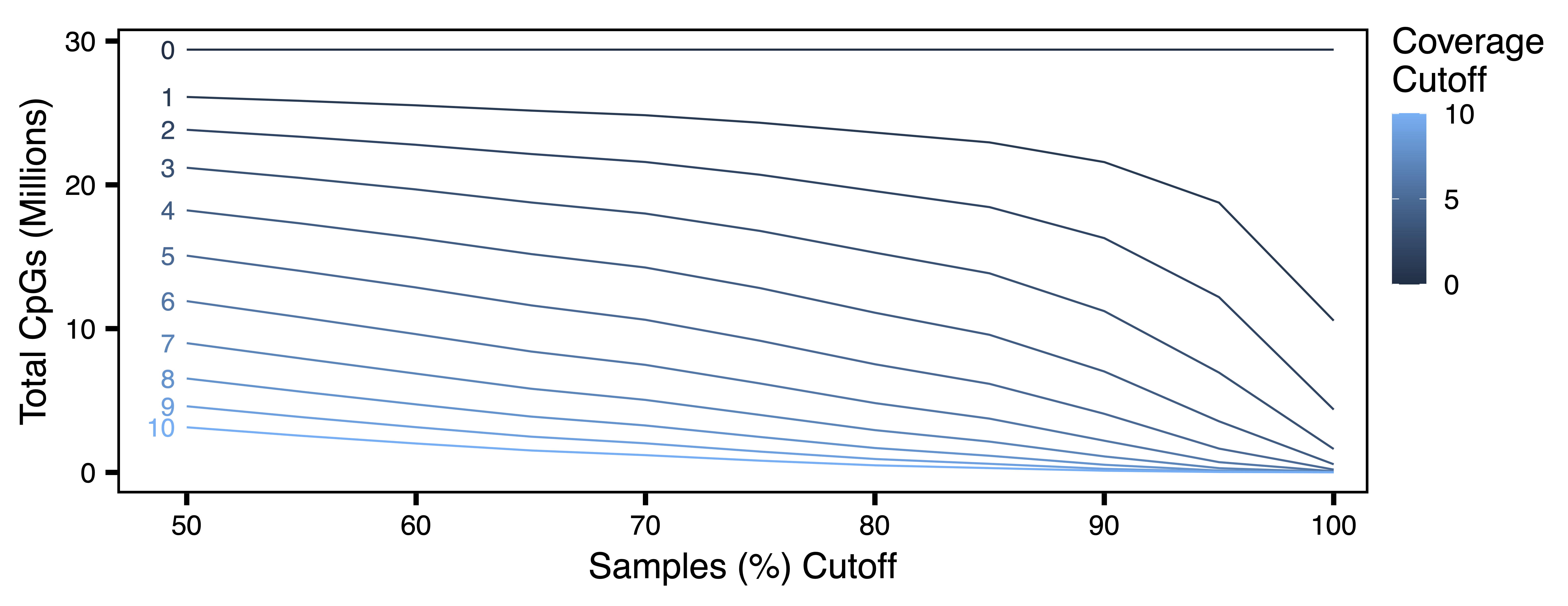
Filter BSobject
filterCpGs() subsets a BSseq object to include only
those CpGs meeting cov and perSample cutoffs
and then saves it as a .rds file. filterCpGs() is designed
to be used after cov and perSample arguments
have been optimized by getCpGtotals() and
plotCpGtotals(). Here we keep only CpGs with at least 2
reads in at least 75% of samples.
bs <- filterCpGs(bs, cov = 2, perSample = 0.75, file = "Filtered_BSseq.rds")Call Regions
getRegions() generates a set of regions and some
statistics based on the CpGs in a BSseq object. Regions can be defined
based on CpG locations, built-in genomic annotations from
annotatr (as here for gene bodies), or a custom genomic
annotation.
plotRegionStats() plots histograms of region statistics,
while plotSDstats() plots methylation standard deviation
versus region statistics. With these plots, we can get an idea of the
characteristics of our regions and see how methylation variability is
affected. The goal is to identify regions with biological variability
rather than technical variability (due to low coverage).
regions <- getRegions(bs, annotation = "genes", genome = "hg38",
                      file = "Unfiltered_Regions.txt")
plotRegionStats(regions, maxQuantile = 0.99, file = "Unfiltered_Region_Plots.pdf")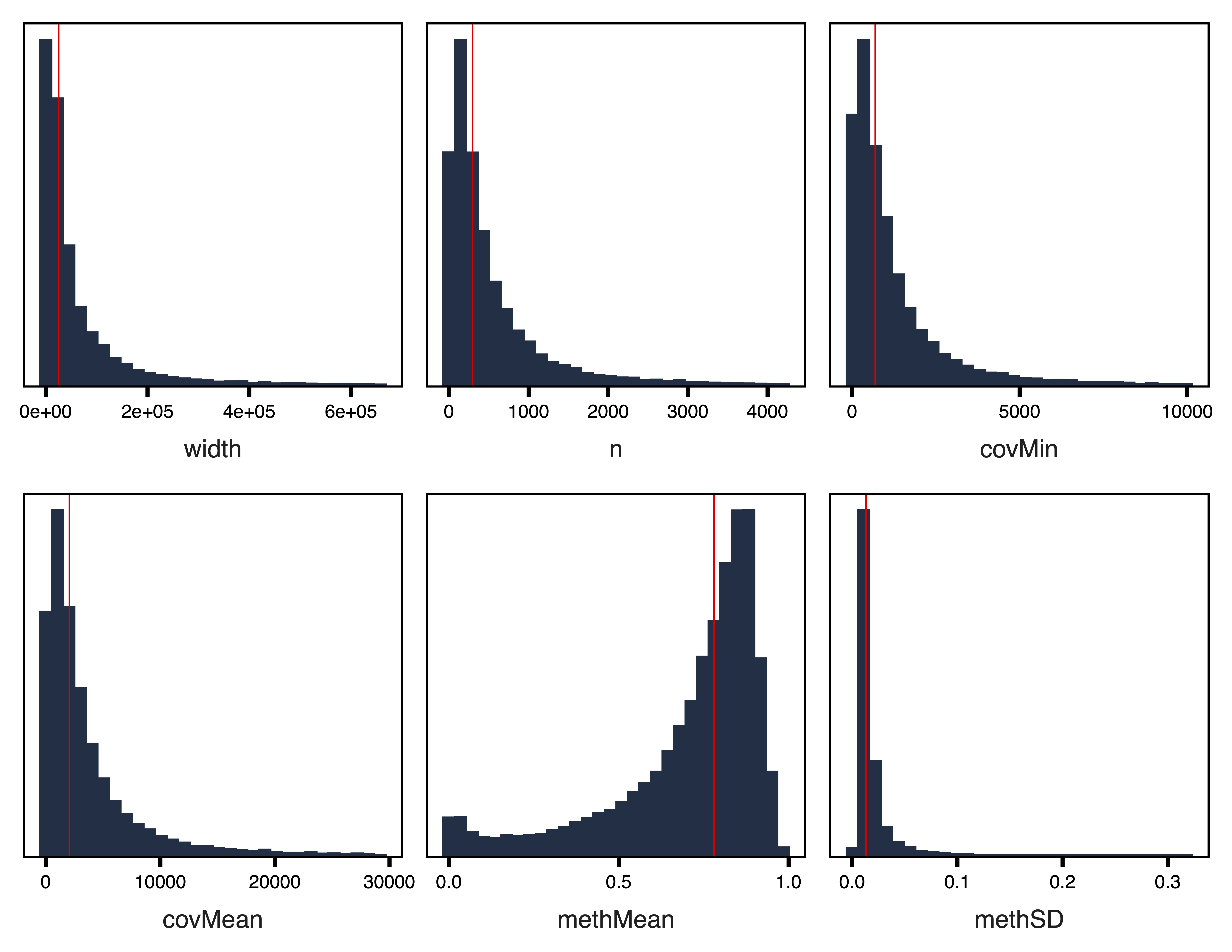
plotSDstats(regions, maxQuantile = 0.99, file = "Unfiltered_SD_Plots.pdf")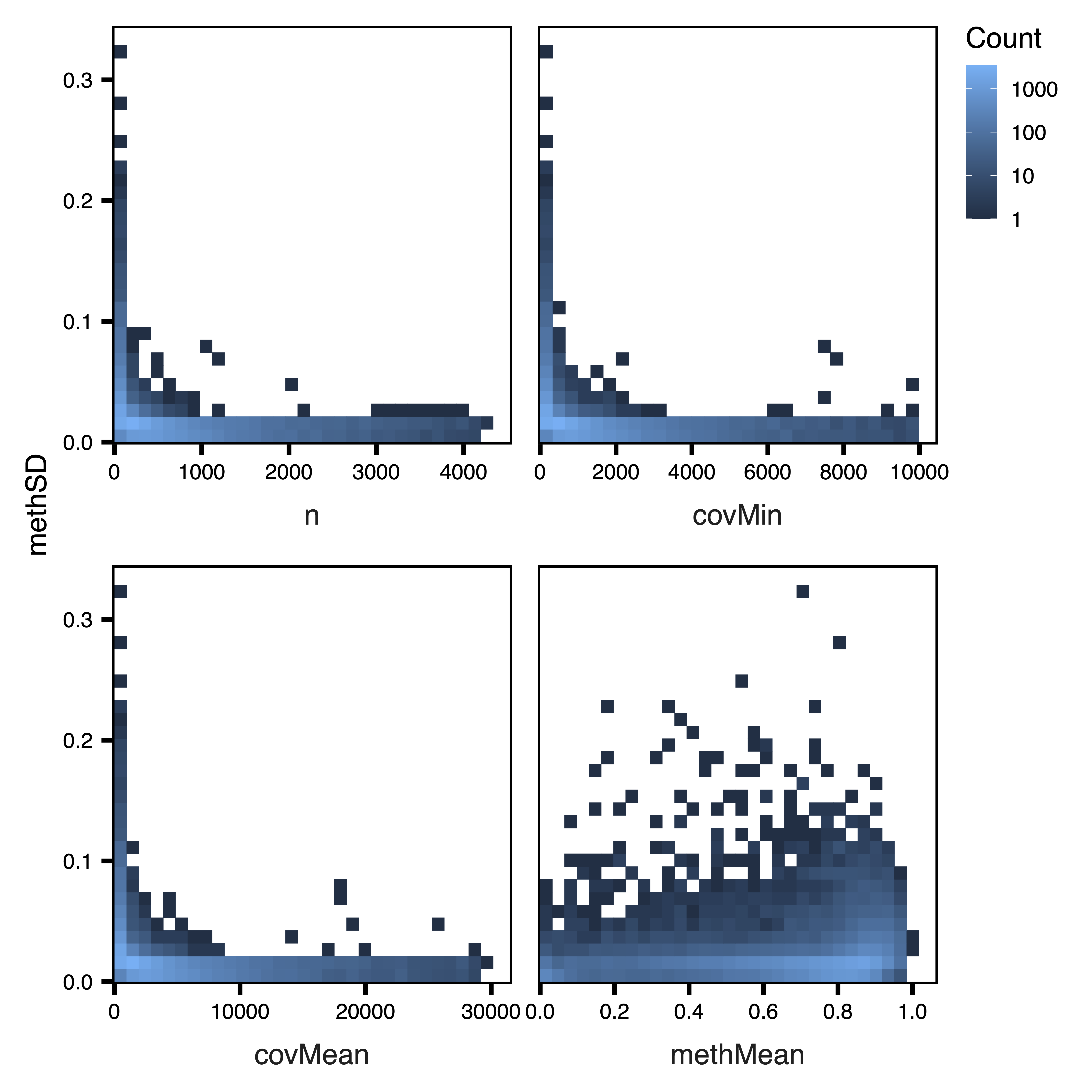
Examine Region Totals at Different Cutoffs
getRegionTotals() calculates region totals at specified
covMin and methSD cutoffs. Total regions (and thus total width and CpGs)
are expected to decrease as the minimum coverage cutoff increases and SD
cutoff increases. Here we also adjust the potential covMin and methSD
cutoffs to match the higher coverage and lower methylation variation of
gene bodies. plotRegionTotals() plots these region totals
by covMin and methSD cutoffs.
regionTotals <- getRegionTotals(regions, covMin = seq(0, 100, 10),
                                methSD = seq(0, 0.02, 0.002),
                                file = "Region_Totals.txt")
plotRegionTotals(regionTotals, file = "Region_Totals.pdf")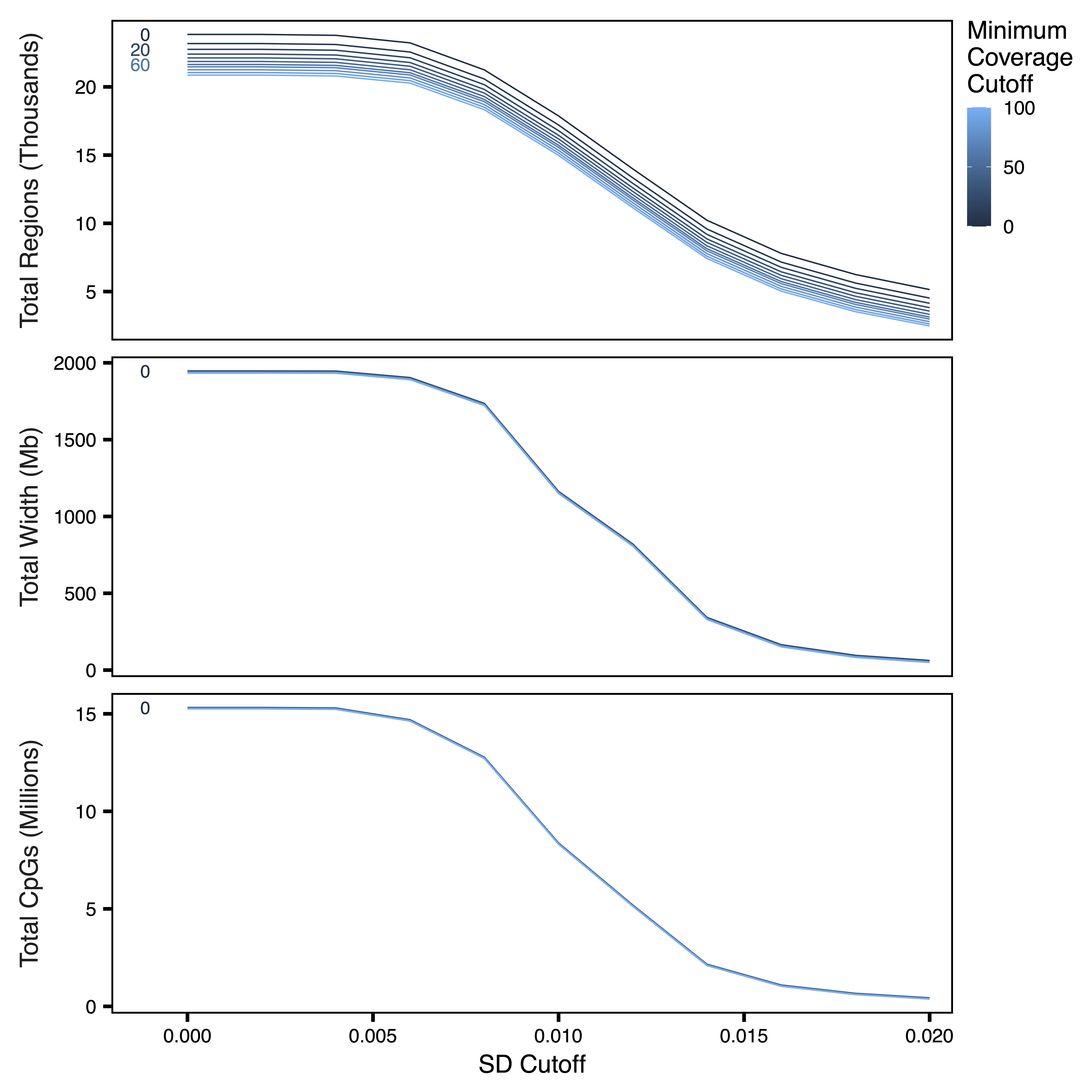
Filter Regions
filterRegions() subsets the regions to only include
those meeting covMin and methSD cutoffs.
filterRegions() is designed to be used after
covMin and methSD functions have been
optimized with getRegionTotals() and
plotRegionTotals(). Here we filter for regions with at
least 10 reads in all samples. We don’t use a standard deviation filter
here because the region set is small enough already to use for network
construction. Next, we examine our regions again with
plotRegionStats() after filtering.
regions <- filterRegions(regions, covMin = 10, methSD = 0,
                         file = "Filtered_Regions.txt")
plotRegionStats(regions, maxQuantile = 0.99, file = "Filtered_Region_Plots.pdf")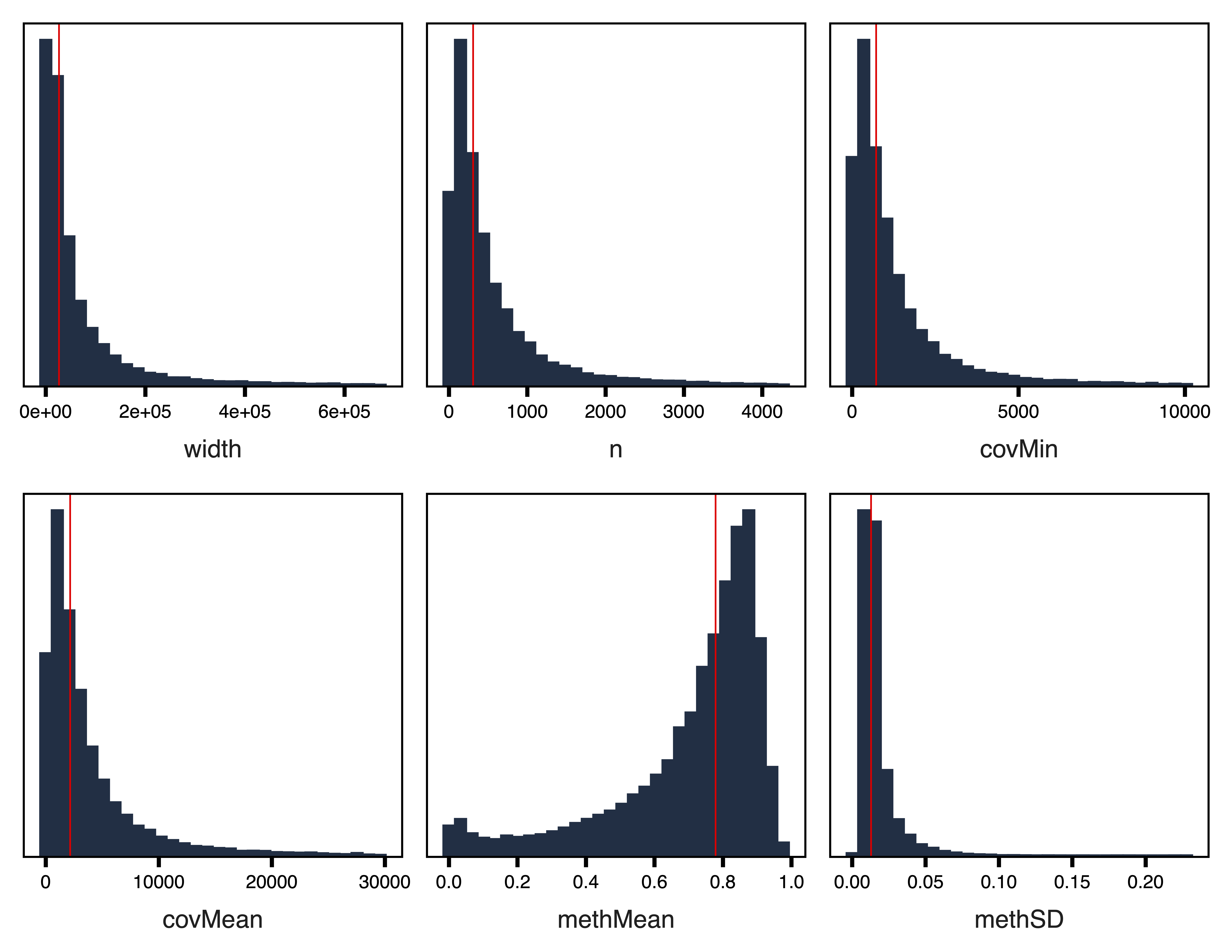
Adjust Methylation Data for Principal Components
getRegionMeth() calculates region methylation from a
BSseq object and saves it as a .rds. model.matrix() creates
a design matrix for our set of samples. getPCs() calculates
the top principal components, and then adjustRegionMeth()
adjusts the region methylation for the top PCs and saves it as a .rds
file. getDendro() clusters the samples based on the
adjusted region methylation using Euclidean distance, while
plotDendro() plots the dendrogram. We can use this
dendrogram to see if there are any outlier samples or samples clustering
separately due to batch effects.
meth <- getRegionMeth(regions, bs = bs, file = "Region_Methylation.rds")
mod <- model.matrix(~1, data = pData(bs))
PCs <- getPCs(meth, mod = mod, file = "Top_Principal_Components.rds")
methAdj <- adjustRegionMeth(meth, PCs = PCs,
                            file = "Adjusted_Region_Methylation.rds")
getDendro(methAdj, distance = "euclidean") %>%
  plotDendro(file = "Sample_Dendrogram.pdf", expandY = c(0.25, 0.08))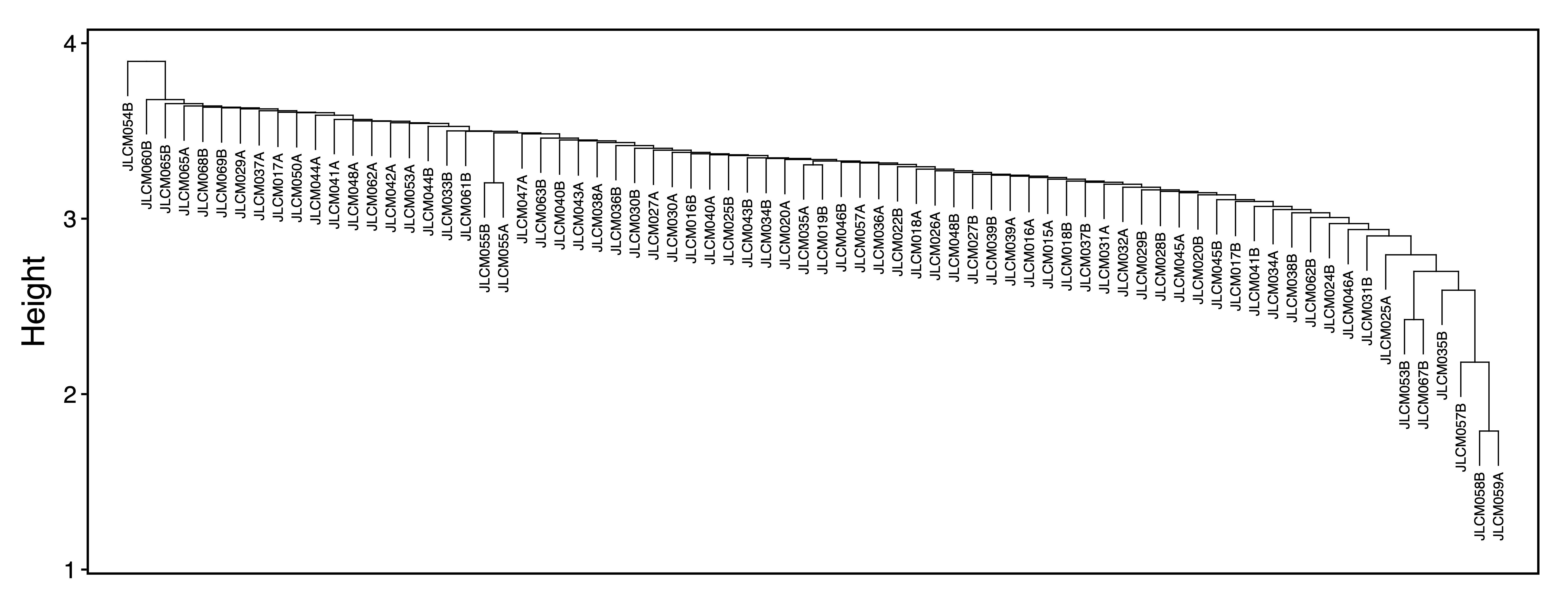
Select Soft Power Threshold
getSoftPower() analyzes scale-free topology with Pearson
or Bicor correlations to determine the best soft-thresholding power.
This refers to the power to which all correlations are raised and how
much more stronger correlations are weighted compared to weaker
correlations. Pearson correlation is more sensitive than Bicor
correlation, but is also more influenced by outlier samples. We use
Pearson correlation in order to have higher power to detect correlated
regions in a dataset with relatively low variability between
samples.
plotSoftPower() plots the soft power threshold against
scale free topology fit and connectivity. Typically, as the soft power
threshold increases, fit increases and connectivity decreases. A soft
power threshold should be selected as the lowest threshold where fit is
0.8 or higher (here we use 12).
sft <- getSoftPower(methAdj, corType = "pearson", file = "Soft_Power.rds")
plotSoftPower(sft, file = "Soft_Power_Plots.pdf")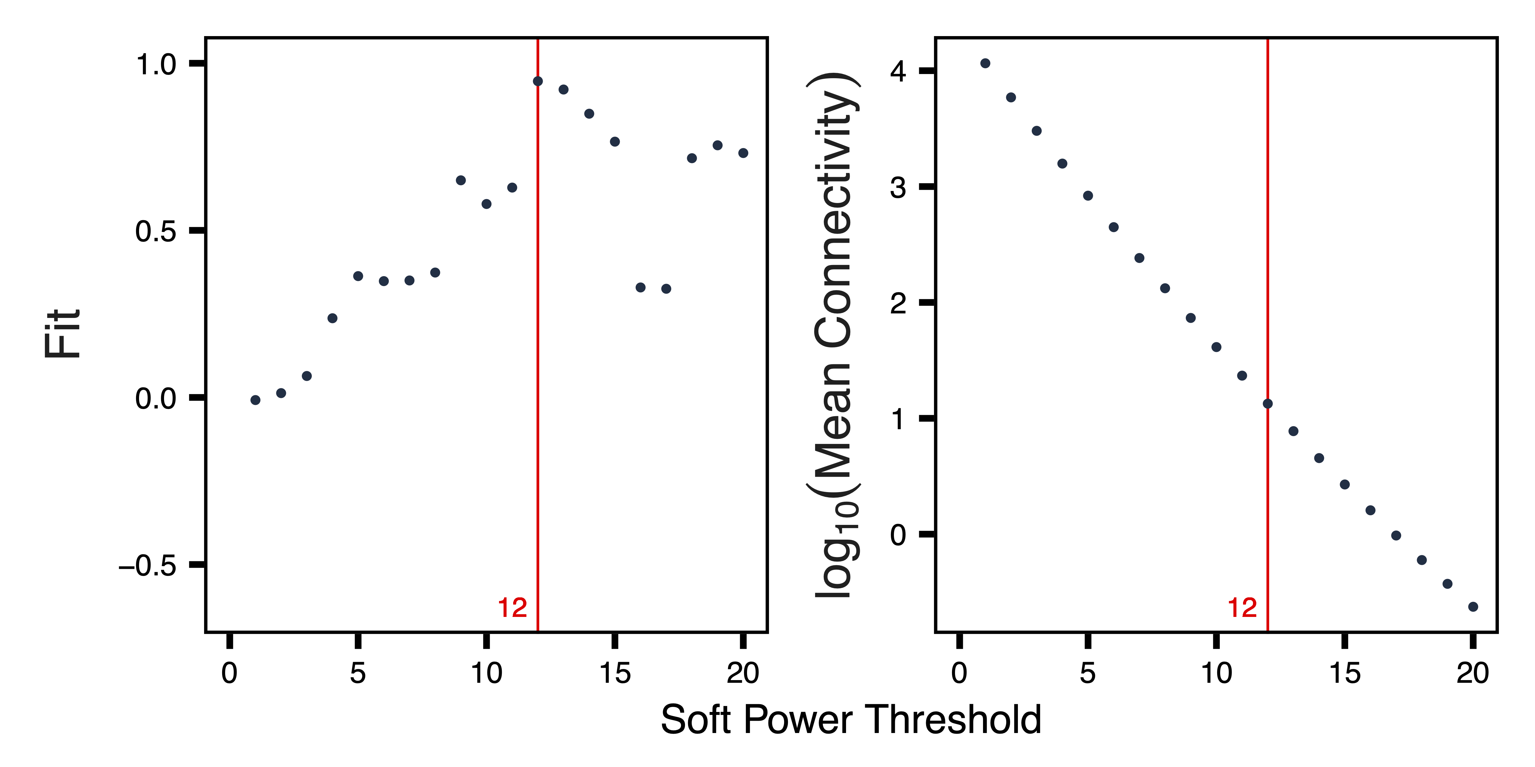
Get Comethylation Modules
getModules() identifies comethylation modules using
filtered regions, a chosen soft power threshold, and either Pearson or
Bicor correlation. Here we use Pearson correlation for the greater
sensitivity to detect modules. Regions are first formed into blocks
close to but not exceeding the maximum block size. For this particular
analysis, all regions can fit into a single block. A full network
analysis is then performed to assign regions to modules; modules are
merged if their eigennodes are highly correlated. The modules are then
saved as a .rds file.
plotRegionDendro() plots region dendrograms and modules
for each block. getModuleBED() creates a BED file of
regions annotated with module assignments for visualization in a genome
browser.
modules <- getModules(methAdj, power = 12, regions = regions,
                      corType = "pearson", file = "Modules.rds")
plotRegionDendro(modules, file = "Region_Dendrograms.pdf")
BED <- getModuleBED(modules$regions, file = "Modules.bed")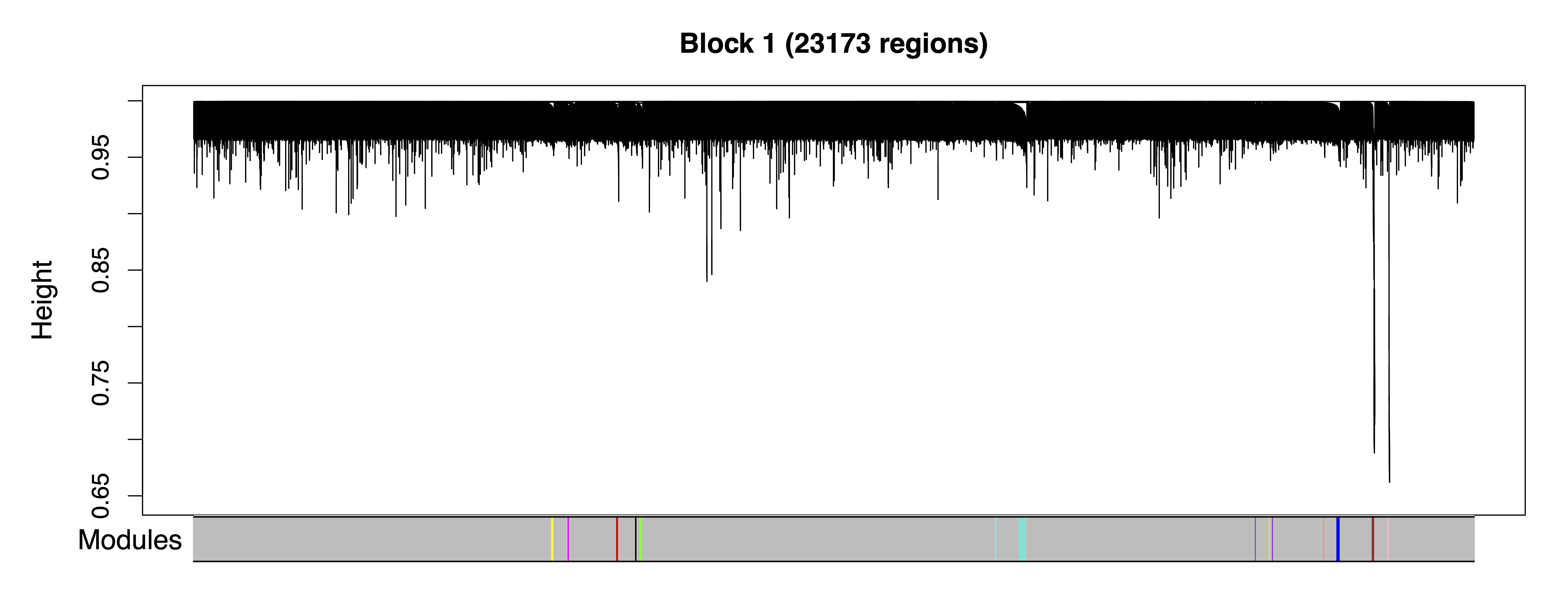
Examine Correlations between Modules and Samples
In order to examine relationships between modules,
getDendro(MEs) clusters modules based on eigennode values
using Bicor or Pearson correlations, which are then plotted with
plotDendro(). getCor(MEs) calculates a
correlation matrix for module eigennodes using Bicor or Pearson
correlations, which are then plotted with plotHeatmap(). We
use Bicor correlations at this stage to identify robust associations
with less impact of outliers. Note that module correlation statistics
(with p-values) can also be calculated with
getMEtraitCor(). We can use these plots to identify groups
of correlated modules.
MEs <- modules$MEs
moduleDendro <- getDendro(MEs, distance = "bicor")
plotDendro(moduleDendro, labelSize = 5, nBreaks = 5, file = "Module_ME_Dendrogram.pdf")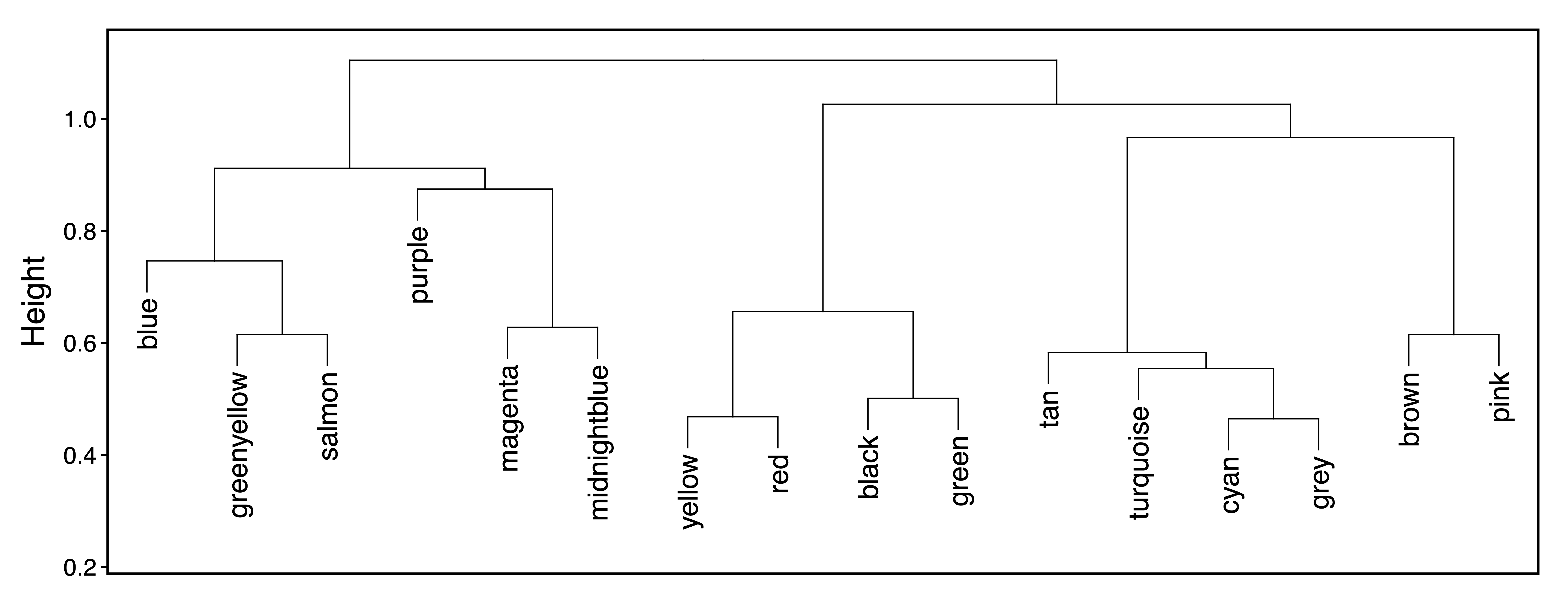
moduleCor <- getCor(MEs, corType = "bicor")
plotHeatmap(moduleCor, rowDendro = moduleDendro, colDendro = moduleDendro, file = "Module_Correlation_Heatmap.pdf")
moduleCorStats <- getMEtraitCor(MEs, colData = MEs, corType = "bicor", robustY = TRUE, file = "Module_Correlation_Stats.txt")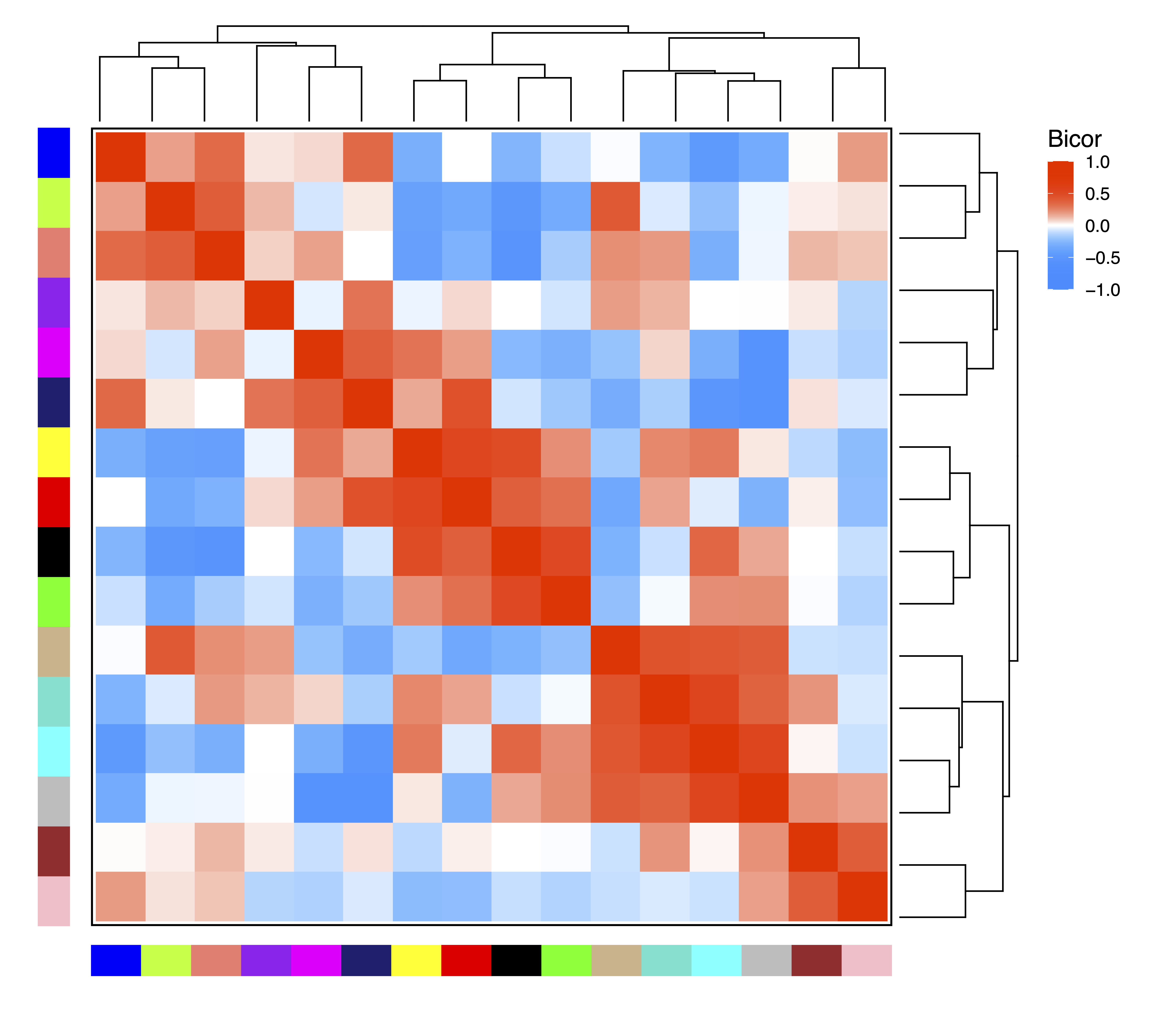
To explore associations between samples,
getDendro(MEs, transpose = TRUE) clusters the samples based
on module eigennode values using Bicor or Pearson correlations, which
are then plotted with plotDendro().
getCor(MEs, transpose = TRUE) calculates a correlation
matrix for samples based on module eigennode vales using Bicor or
Pearson correlations, which are then plotted with
plotHeatmap(). plotHeatmap() can also be used
to visualize module eigennode values for each sample as below. These
plots can be useful to identify sets of samples with correlated
methylation at these regions. This may also reveal the impact of batch
effects on the identified modules.
sampleDendro <- getDendro(MEs, transpose = TRUE, distance = "bicor")
plotDendro(sampleDendro, labelSize = 3, nBreaks = 5, file = "Sample_ME_Dendrogram.pdf")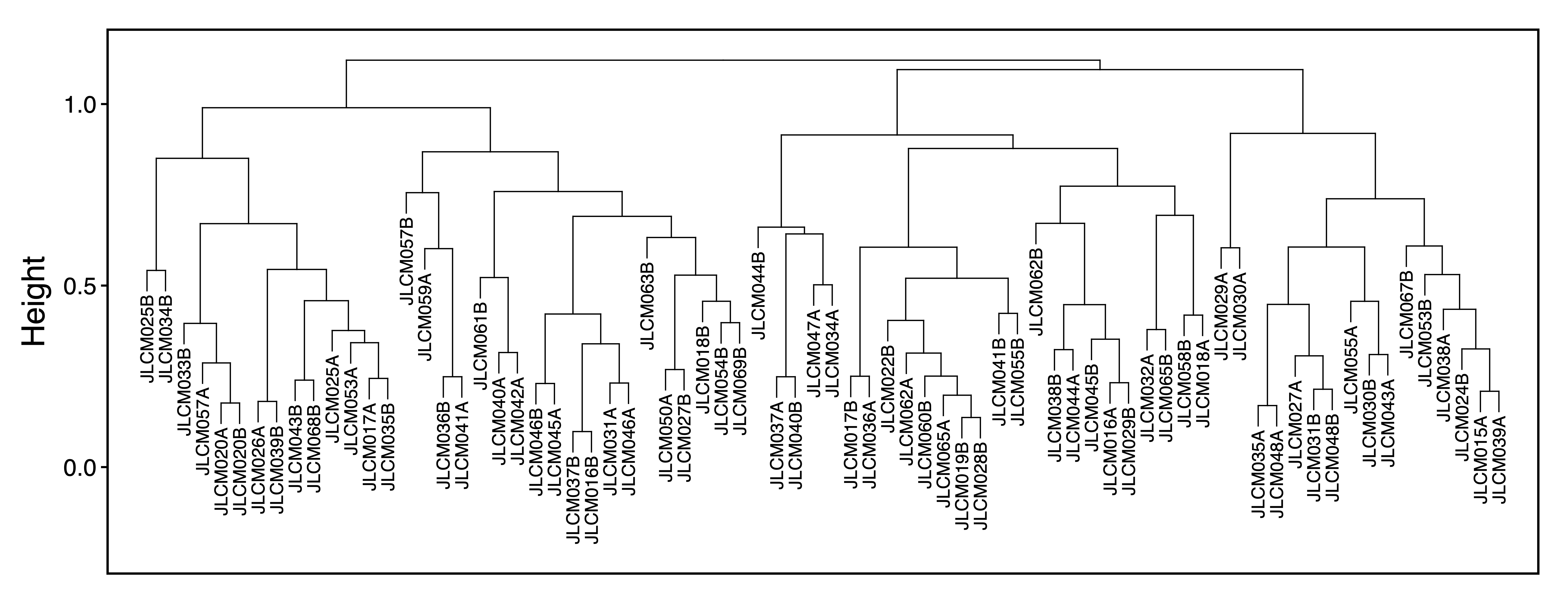
sampleCor <- getCor(MEs, transpose = TRUE, corType = "bicor")
plotHeatmap(sampleCor, rowDendro = sampleDendro, colDendro = sampleDendro, file = "Sample_Correlation_Heatmap.pdf")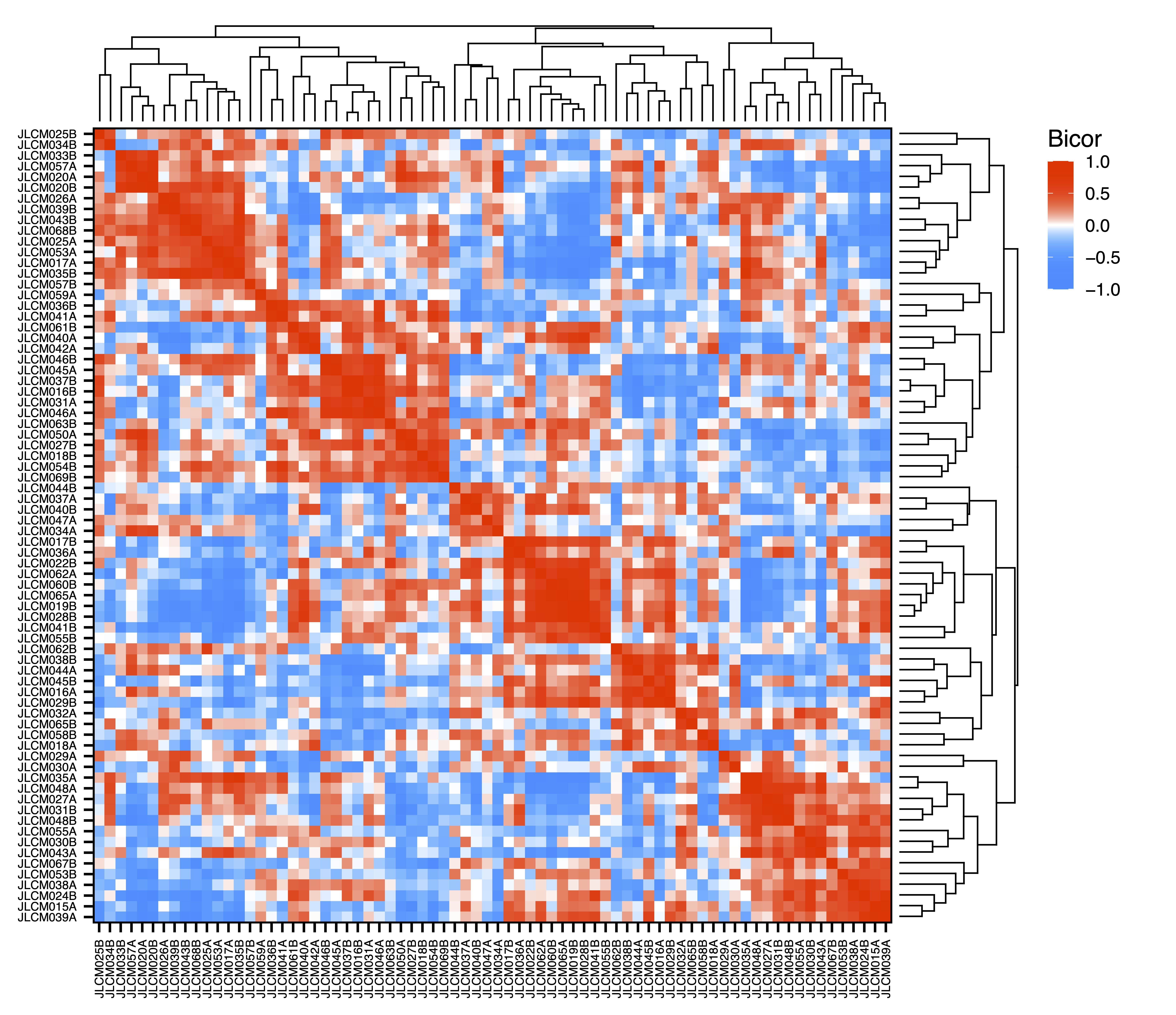
plotHeatmap(MEs, rowDendro = sampleDendro, colDendro = moduleDendro, legend.title = "Module\nEigennode", legend.position = c(0.37,0.89), file = "Sample_ME_Heatmap.pdf")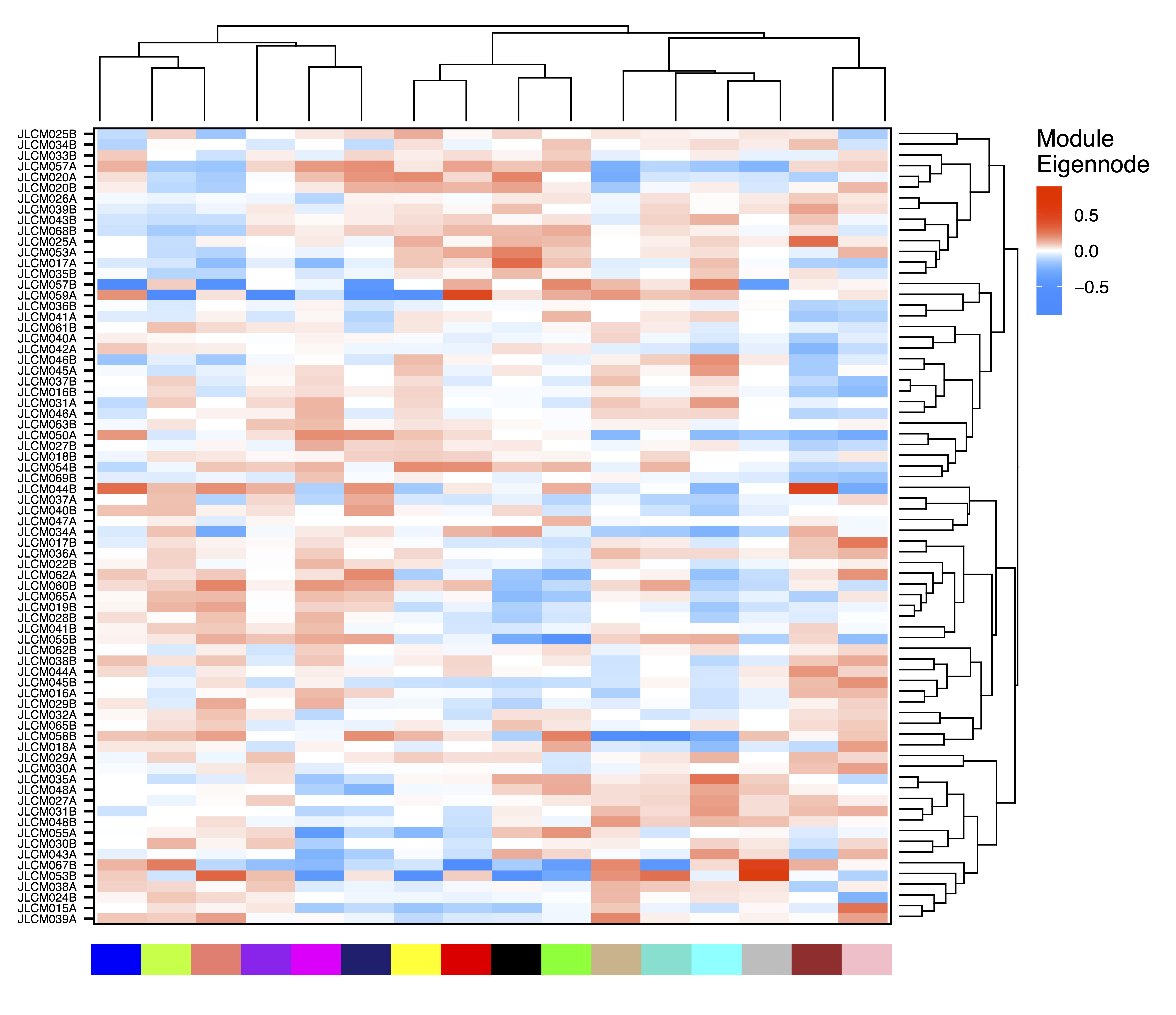
Test Correlations between Module Eigennodes and Sample Traits
Next we can look for modules associated with sample traits.
getMEtraitCor() tests associations between module
eigennodes and sample traits using Bicor or Pearson correlation.
getCor() calculates a correlation matrix for sample traits
using Bicor or Pearson correlations, which are clustered with
getDendro(), and then plotted with
plotDendro(). This allows us to identify correlated traits
and order both traits and modules on the heatmap by similarity.
plotMEtraitCor() creates a heatmap of sample traits versus
modules. To focus on the top associations, another heatmap is created
showing only the top 15 associations by p-value. Significant
associations can be identified by a star or the p-value itself. Here we
identify significant correlations between several modules and sample
traits including cell type proportions, genome-wide methylation, and
even home ownership.
MEtraitCor <- getMEtraitCor(MEs, colData = colData, corType = "bicor", file = "ME_Trait_Correlation_Stats.txt")
traitDendro <- getCor(MEs, y = colData, corType = "bicor", robustY = FALSE) %>% getDendro(transpose = TRUE)
plotDendro(traitDendro, labelSize = 3.5, expandY = c(0.65,0.08), file = "Trait_Dendrogram.pdf")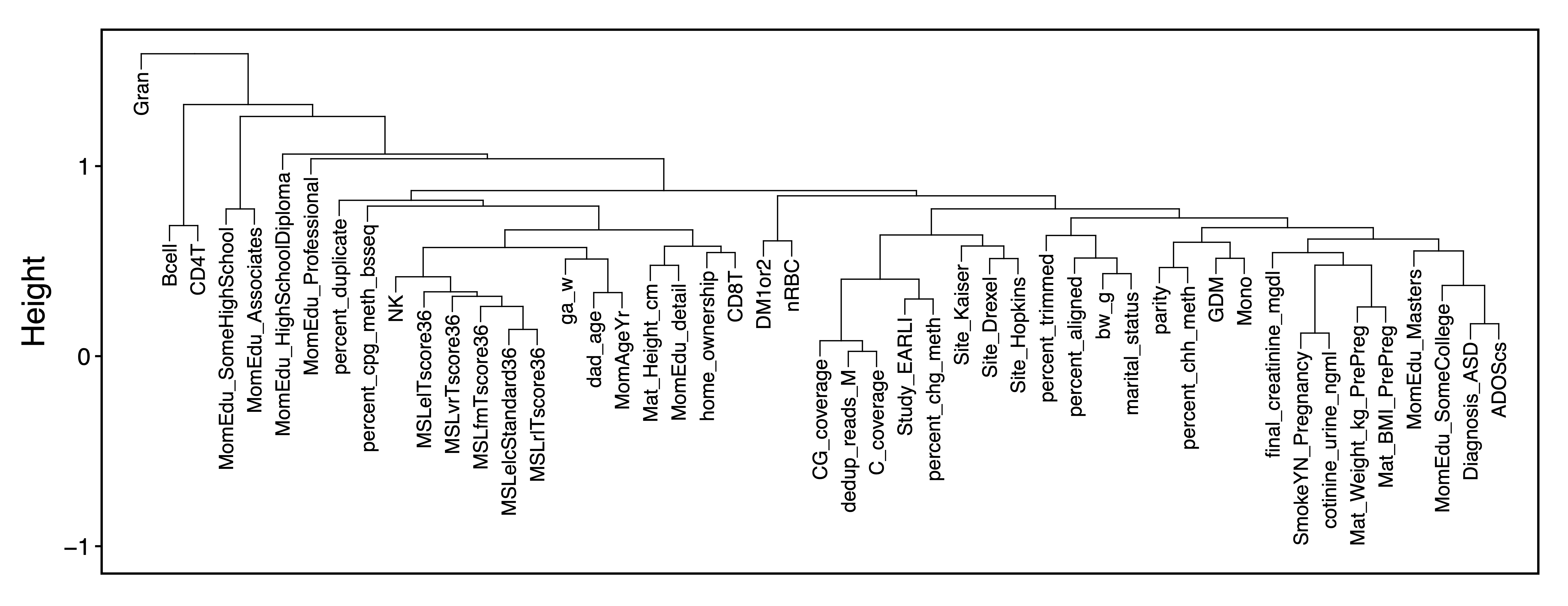
plotMEtraitCor(MEtraitCor, moduleOrder = moduleDendro$order, traitOrder = traitDendro$order, file = "ME_Trait_Correlation_Heatmap.pdf")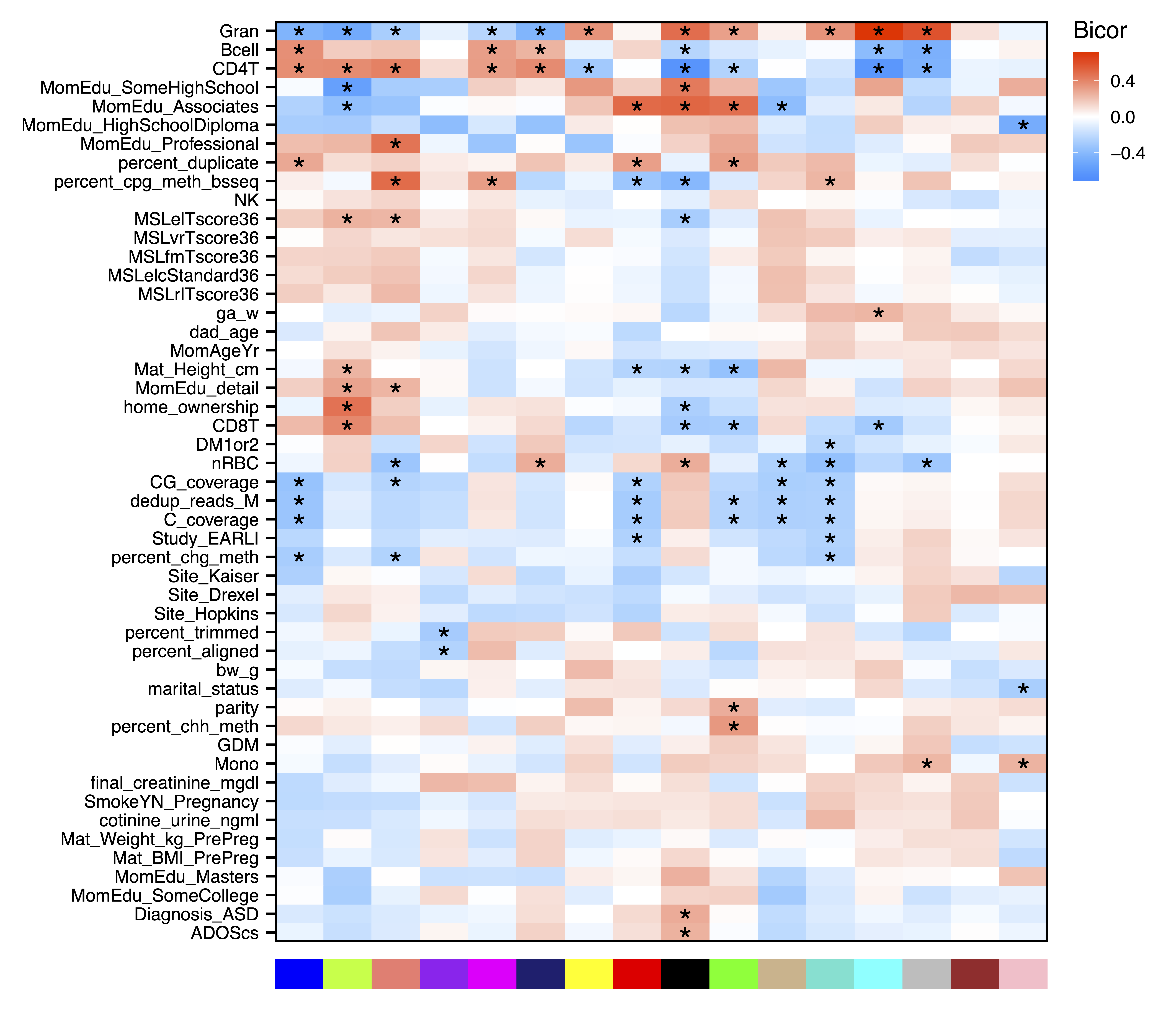
plotMEtraitCor(MEtraitCor, moduleOrder = moduleDendro$order, traitOrder = traitDendro$order, topOnly = TRUE, label.type = "p", label.size = 4, label.nudge_y = 0, legend.position = c(1.14, 0.745), colColorMargins = c(-1,5.1,0.5,10.47), file = "Top_ME_Trait_Correlation_Heatmap.pdf", width = 7, height = 3.5)
Explore Significant Module Eigennode - Trait Correlations
Plot Module Eigennodes vs Traits
To further investigate top module-trait associations,
plotMEtraitDot() creates a dotplot of a module eigennode by
a categorical trait, while plotMEtraitScatter() creates a
scatterplot of a module eigennode by a continuous trait. Any module and
any sample trait can be selected. These plots can help verify that the
module-trait association is robust and identify any outlier samples.
Here we see that the green yellow module has lower methylation with
increasing amounts of granulocytes, but higher methylation with home
ownership.
plotMEtraitScatter(MEs$greenyellow, trait = colData$Gran, ylim = c(-0.25,0.25), xlab = "Granulocytes", ylab = "Green Yellow Module Eigennode", file = "greenyellow_ME_Granulocytes_Scatterplot.pdf")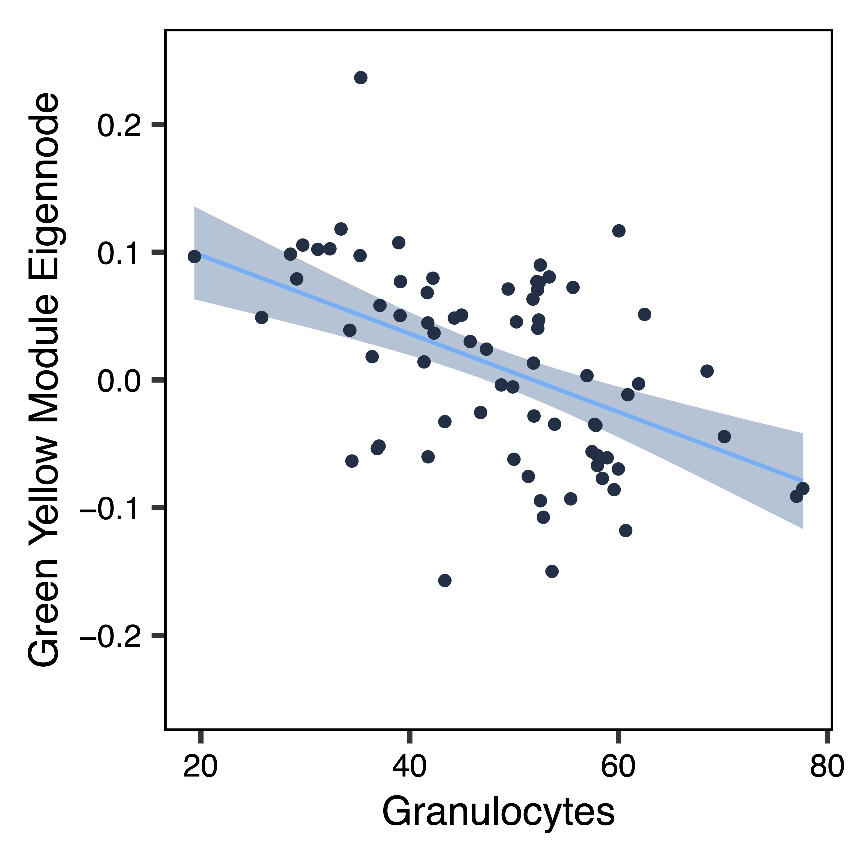
plotMEtraitDot(MEs$greenyellow, trait = colData$home_ownership, binwidth = 0.015, traitCode = c("No" = 0, "Yes" = 1), colors = c("No" = "#3366CC", "Yes" = "#FF3366"), ylim = c(-0.25,0.25), xlab = "Home Ownership", nBreaks = 5, ylab = "Green Yellow Module Eigennode", file = "greenyellow_ME_Home_Ownership_Dotplot.pdf")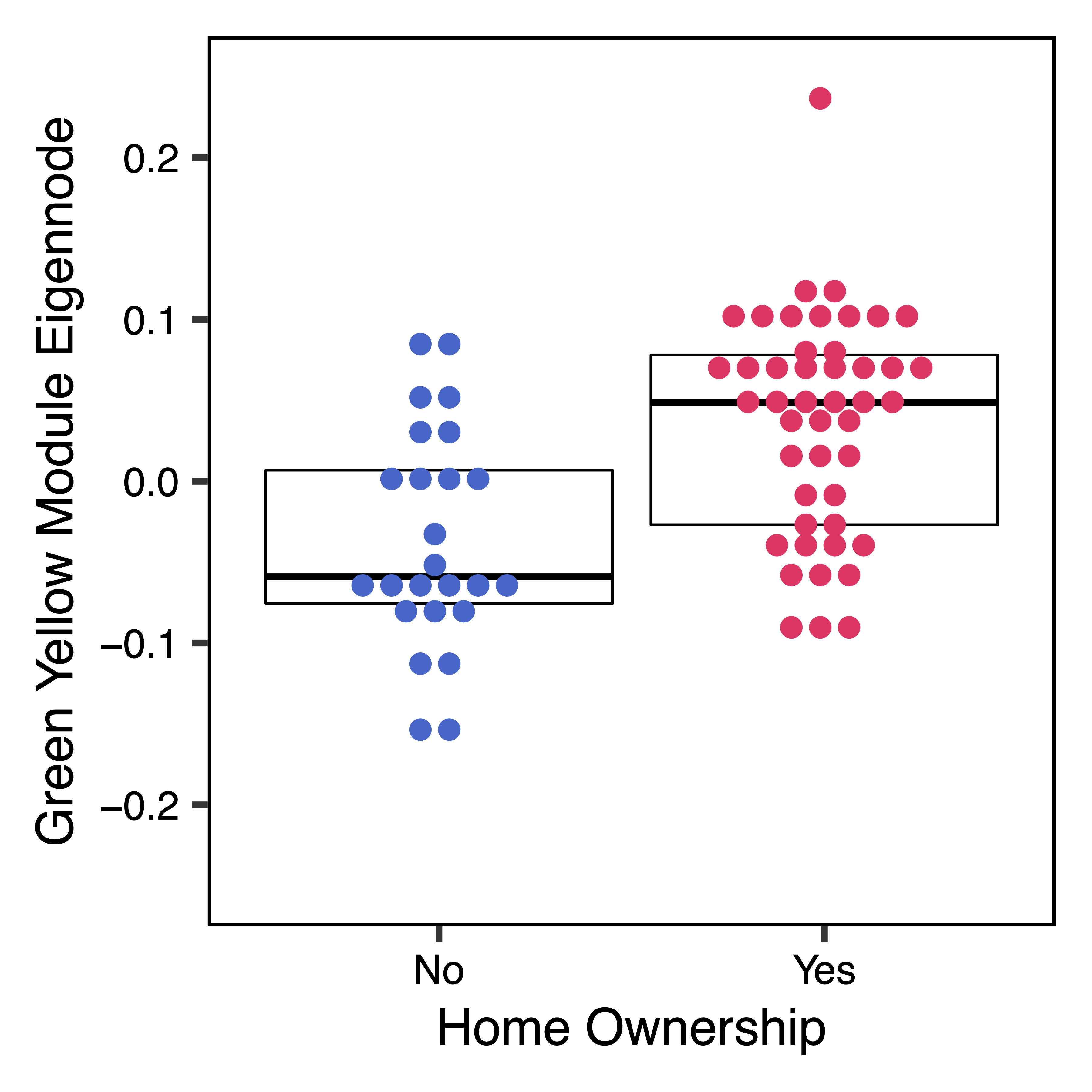
Plot Region Methylation vs Traits
Next we dig further into the data and plot the raw methylation values
against a sample trait using plotMethTrait(). These values
are not adjusted by principal components, just centered on the mean
methylation for each region. This allows you to see the change in actual
methylation across regions in a module in relation to a trait. We plot
the same associations as above.
regions <- modules$regions
plotMethTrait("greenyellow", regions = regions, meth = meth, trait = colData$Gran, expandY = 0.04, trait.legend.title = "Granulocytes", trait.legend.position = c(1.034,3.35), traitMargins = c(0,6,1,4.6), file = "greenyellow_Module_Methylation_Granulocytes_Heatmap.pdf")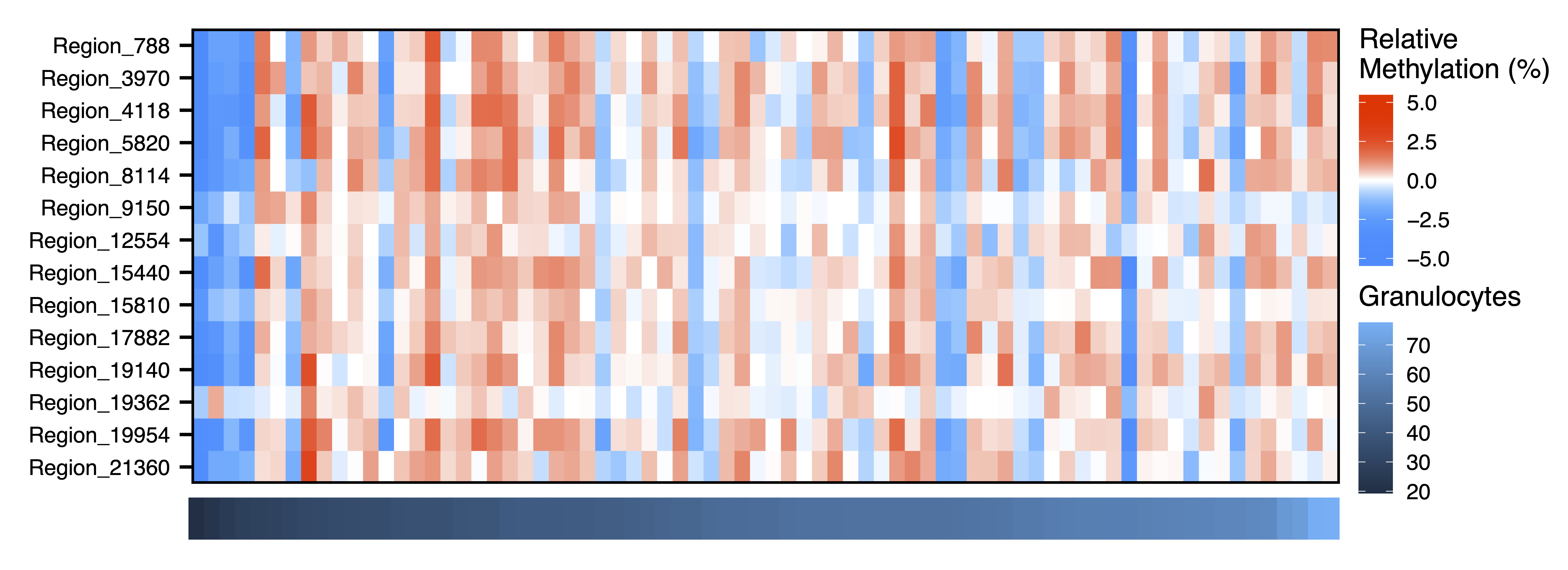
plotMethTrait("greenyellow", regions = regions, meth = meth, trait = colData$home_ownership, expandY = 0.04, traitCode = c("No" = 0, "Yes" = 1), traitColors = c("No" = "#3366CC", "Yes" = "#FF3366"), trait.legend.title = "Home Ownership", trait.legend.position = c(1.05,4.39), traitMargins = c(0,6,1,4.6), file = "greenyellow_Module_Methylation_Home_Ownership_Heatmap.pdf")
Annotate Modules
annotateModule() annotates a module of choice with
nearby gene and CpG island context. Genes are added to regions using
GREAT, gene info is added from BioMart, and both gene and CpG island
context is added from annotatr. getGeneList()
then extracts just the genes for that module, in the form of the gene
symbol, description, Ensembl ID, or NCBI Entrez ID.
regionsAnno <- annotateModule(regions, module = c("greenyellow"), genome = "hg38", file = "Annotated_greenyellow_Module_Regions.txt")
geneList_greenyellow <- getGeneList(regionsAnno, module = "greenyellow")
Analyze Functional Enrichment
Next we test our module of interest for enrichment in genes with
particular functions. listOntologies() gets available
ontologies for GREAT with the selected genome assembly.
enrichModule() analyzes functional enrichments for all
regions assigned to the selected module, relative to the background set
of all regions input into the network (including those assigned to the
grey (unassigned) module). plotEnrichment() then plots the
module enrichments from GREAT.
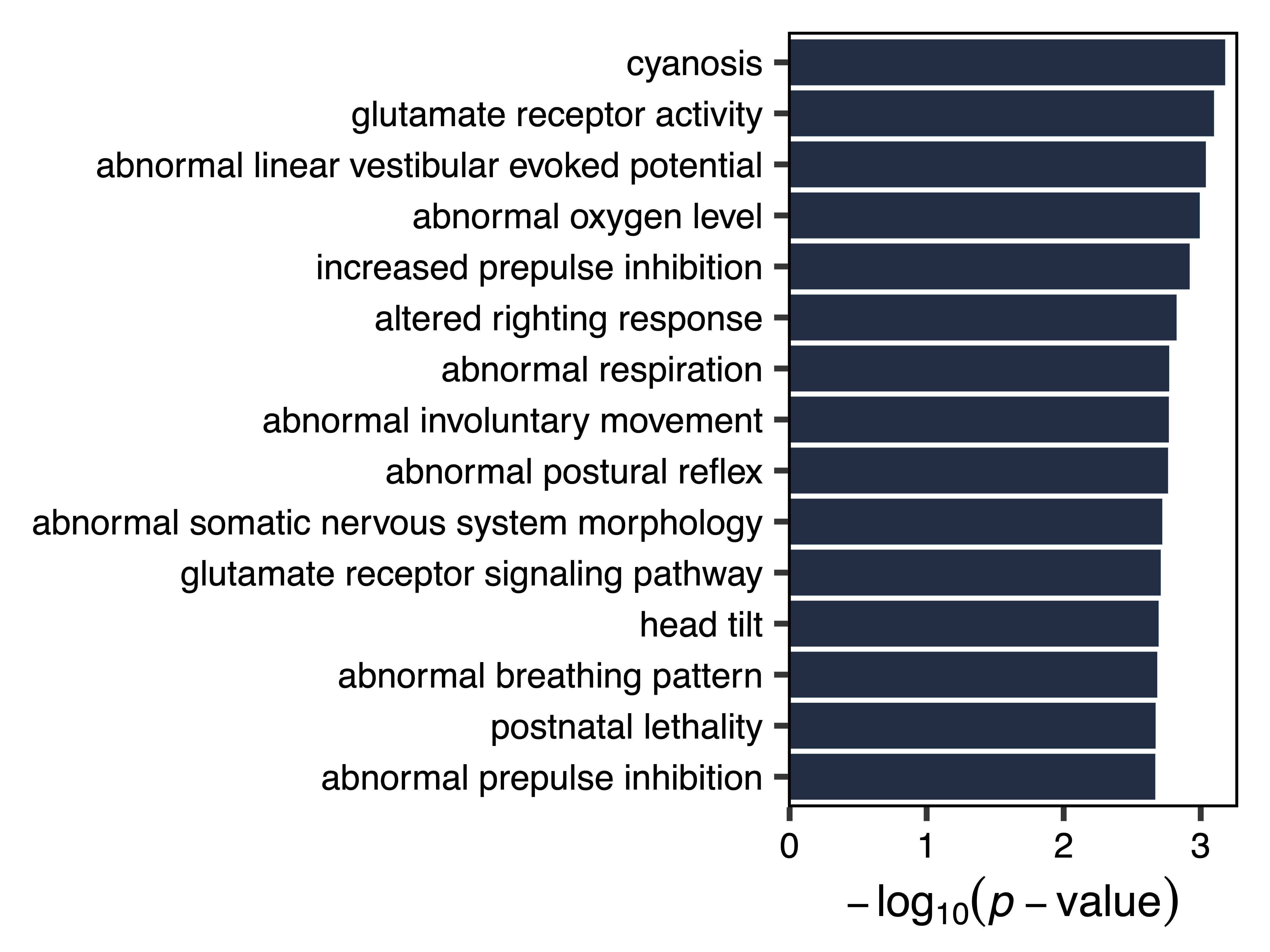
Using this approach, we see that the green yellow module is enriched for genes that play a role in glutamate receptor activity and respiration.
ontologies <- listOntologies("hg38", version = "4.0.4")
enrichment <- enrichModule(regions, module = "greenyellow", genome = "hg38", file = "greenyellow_Module_Enrichment.txt")
plotEnrichment(enrichment, file = "greenyellow_Module_Enrichment_Plot.pdf")